【墨絵と筆文字ロゴのご依頼|店名・看板「鮨濱 神楽坂」様】
墨絵と筆文字ロゴのご依頼|店名・看板「鮨濱 神楽坂」様
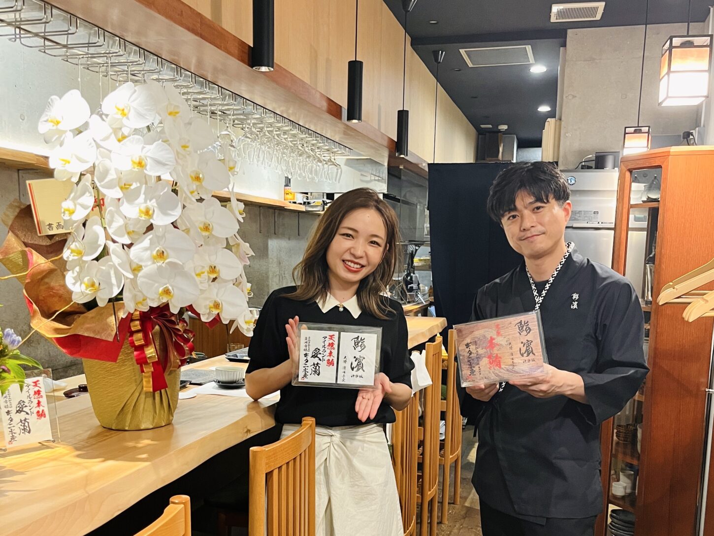
東京は神楽坂にオープンされた「鮨濱 神楽坂」様より、店名・看板のロゴ制作のご依頼をいただきました。
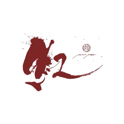
店主の生まれ故郷である高知県の海をイメージして描いた墨絵を背景に、筆文字と掛け合わせた和のロゴを作成しました。
![]()
デザインのポイント
<墨絵>
ゴツゴツした岩が多い海岸、荒波、ギラギラと差し込む太陽の光…といった高知の海の特徴から背景の墨絵をデザイン。荒波にも岩場にも見えるイメージに仕上げました。
<筆文字>
荒波に揉まれ育ち力強い生命力を持つ、活きがいい魚をイメージし、線に動きをつけました。
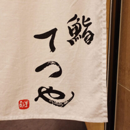
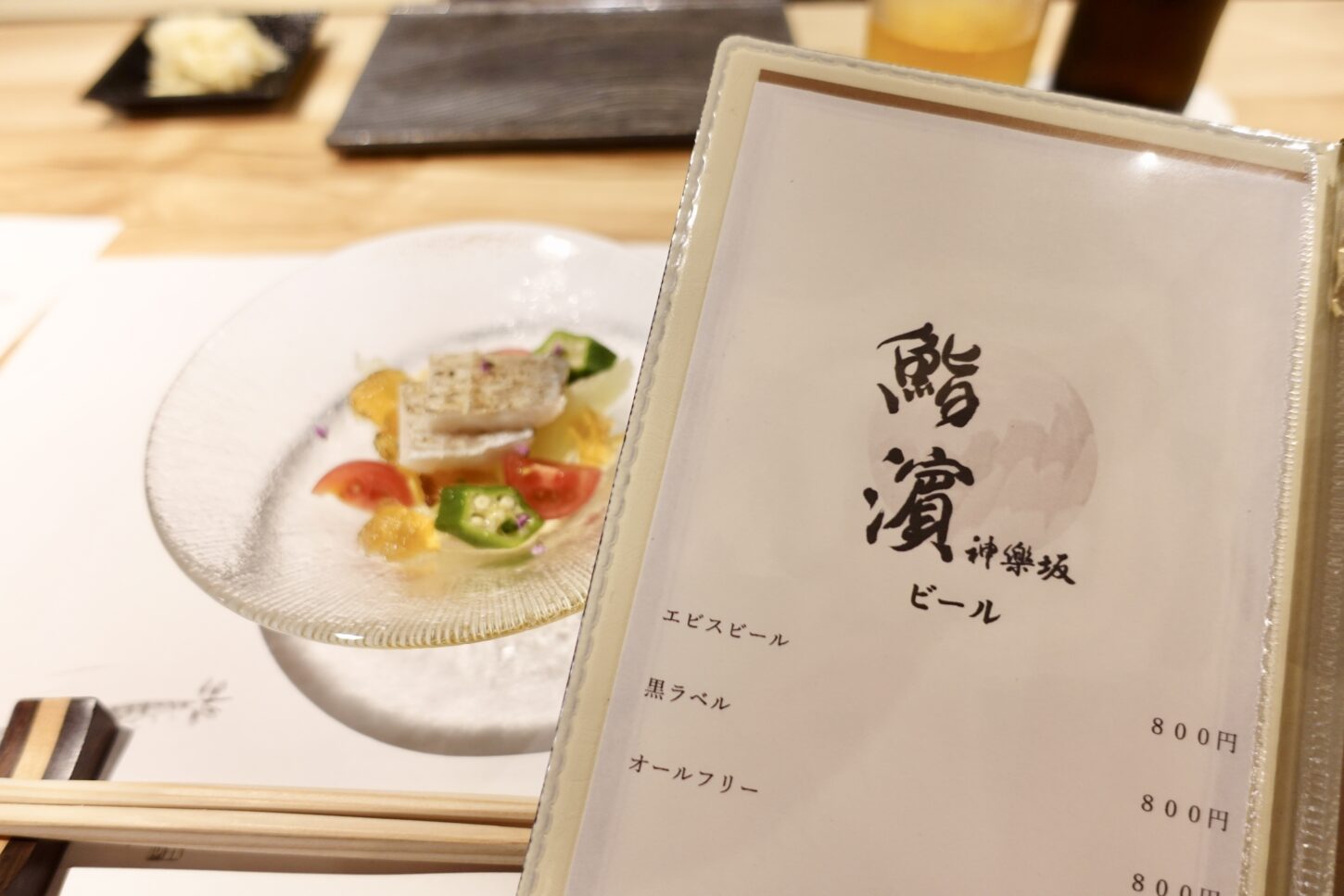
完成作品と使用例
完成した筆文字ロゴは、店舗の看板やメニュー表、SNSアイコンや行燈などにご活用いただいております。
English
I was commissioned to design a name logo and signboard for Sushi Hama Kagurazaka, a newly opened restaurant in Kagurazaka, Tokyo.
The characters were inspired by fresh fish and set against a backdrop of ink paintings evoking the sea of Kochi, the owner’s hometown.
The ink painting depicts the natural scenery of Kochi’s coastline, the rugged rock faces, the crashing waves, and the dazzling sunlight, expressing the strength and depth of the ocean.
I also added movement to the brushstrokes to convey the vitality of the fish thrashing about in the rough waves.
![]()
お店の雰囲気
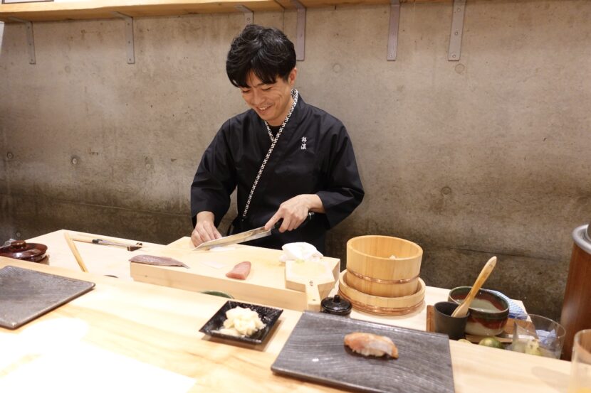
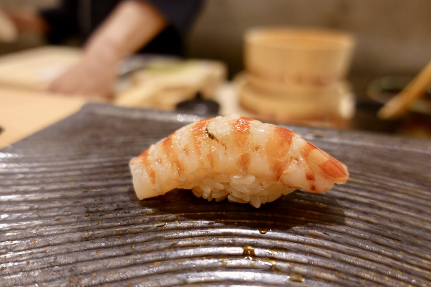
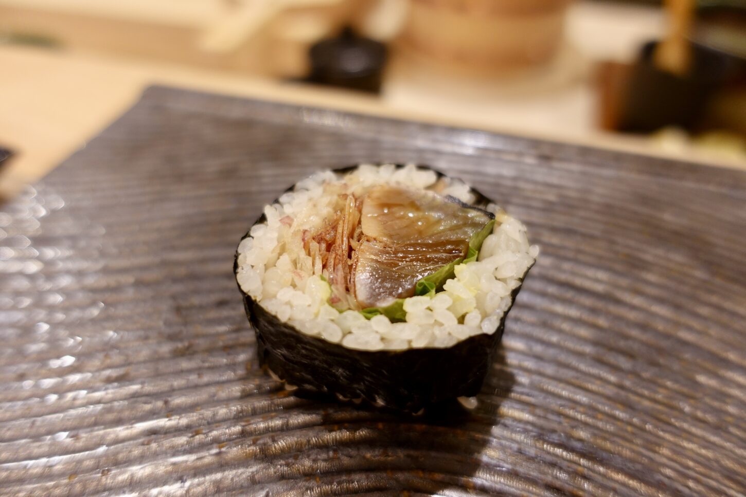
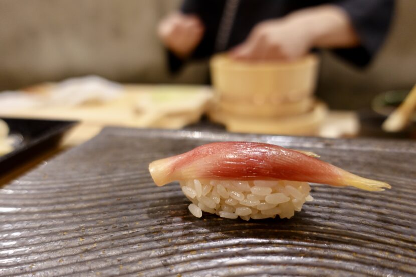
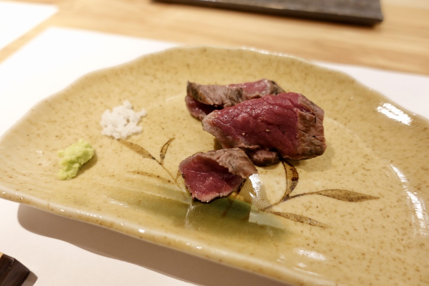
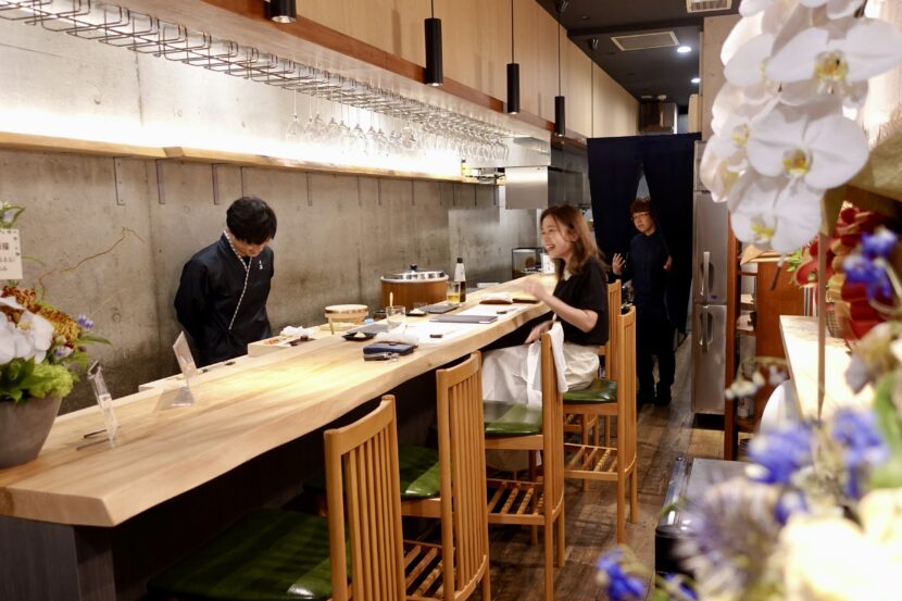
もし神楽坂に行かれる機会があれば、ぜひ一度、お店に立ち寄られてみてください!